
Travelers Insurance
When I joined the Travelers project, the mobile experience wasn't truly a mobile app. It was largely a responsive version of the website presented within a mobile viewport, with limited functionality and an experience that didn't take advantage of native mobile patterns.
As one of two designers on the project, I worked with product managers, engineers, and stakeholders to reimagine key customer journeys and evolve the experience into a product that felt purpose-built for mobile.
Industry
Insurance
Responsibilities
Native App UI Design
Position
UI Designer

Discovery & Strategy
Understanding the customer before touching a pixel.
Insurance is complex, but the moments customers open the app are not. People launch it in a narrow set of high-intent, often high-stress moments: a claim in progress, a payment due, an ID card they need right now. Partnering closely with the UX team, I studied the strategy and the journeys, then explored a wide range of UI component ideas to serve those moments simply.
01.
On-site immersion in the Travelers way.
Twice a week for a month, I traveled from Greater Boston to Hartford, Connecticut to work in the office and absorb how Travelers thinks about its customers, its brand, and its obligations. Designing for a regulated enterprise means understanding it from the inside.
02.
Partnering with UX on strategy.
Working shoulder to shoulder with the UX designers, I translated research and journey strategy into interface ideas — exploring multiple component directions for each key moment before converging on the strongest.

03.
Iterating from real user feedback.
I observed real users interacting with the wireframes and watched where they hesitated, tapped, and got stuck. Those sessions directly shaped the interface: I refined navigation, layout, and components based on how people actually behaved, not on assumptions.
04.
Elevating the evolving design system.
I took the design system as it was maturing and lifted the UI to a more modern aesthetic: simple and clean, but welcoming and on brand. The goal was an interface that felt trustworthy at a glance.


Insurance is already complicated.
The app shouldn't be.
The Flow Redesign
Rebuilding registration & onboarding to be guided and user-centric.
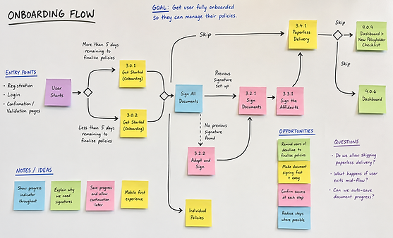
The existing flow asked people for information the system already had, and buried onboarding tasks in a flat list. I mapped the current experience end to end, then redesigned it against five principles.
Guided lookup
A step-by-step "find your policy" replaces a wall of manual fields.
Fewer asks
First name, last name and billing number removed once the policy supplies them.
Clearer onboarding
A flat to-do list became structured states: outstanding, pending, done.

The Pitch
Winning the room.
I presented my designs to a group of 50, including a chief officer, with the home screen prototyped to pitch the microinteractions live. I walked through the work, made the case for modern design and why earning a customer's trust matters, and closed with an animation I created to sell the microinteractions and get buy-in.
The presentation landed. My design approach was selected to move forward, and the app is still shipped today.


